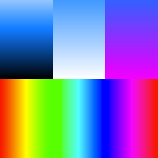
Gradients made without the CSS gradient property. [July, 2013]
WELCOME TO “ECSSPLORATIONS”, WHERE YOU CAN EXPLORE some of the more unusual effects that are possible with pure CSS and HTML. Most of what you’ll find here is not about using CSS to format ordinary web pages. Instead, you’ll find it being used to reproduce effects normally handled by javascript or images — things like animations, site navigation, hover effects, hiding or showing content, and drawings or other graphics. Except where noted, no scripts or images are used (data URI-encoded images are allowed, since they are part of the CSS). [+ More.][– Less.]
This site stems from two ideas: (1) that javascript shouldn’t be used to do things that CSS is capable of doing by itself (given proper browser support), and (2), that graphic effects should be rendered with CSS wherever possible.
Of course, javascript can do many things more easily and efficiently than pure CSS, and it is necessary for actual website functionality. But too often javascript is called in to handle the purely presentational aspects of websites, which seems like overkill. Similarly, simple (and not so simple) graphics bulk up websites and require trips to separate editing software to make even the most trivial changes: why go to Photoshop to adjust a color when you could edit a single line of code?
On the other hand, it is interesting to see how far CSS and HTML can be pushed into doing functional work to create things like lightboxes and tabbed UIs.
Caveats: Many of the examples demonstrated here use advanced or esoteric CSS properties which may not be supported by older browsers and/or which may be buggy even in newer browsers. Some are designed to work with the :hover event and won’t work on touch devices (yet). Finally, some of the examples shown here are wildly impractical for any “real world” scenario, involving complex or lengthy code. Some may give your CPU a workout and make your fans spin up. They are presented here for demonstration purposes only. Enjoy! [– Less.]
Gradients made without the CSS gradient property. [July, 2013]

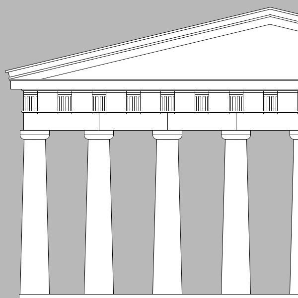
An improved version of my original pure css Parthenon drawing. [July, 2013]
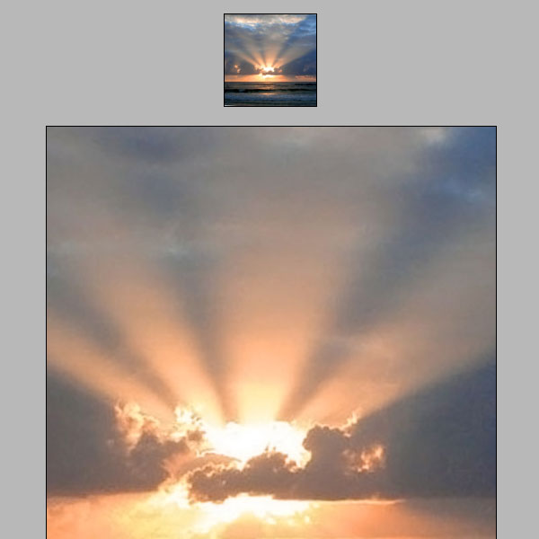
A ridiculously impractical implementation of a “magnifying glass” effect for a hovered image.
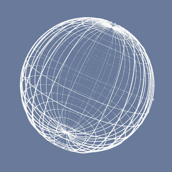
A rotating globe using practically every CSS3 trick in the book.
A CSS drawing of a night sky, featuring the moon and almost 200 accurately-positioned stars.
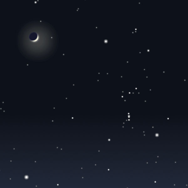
Hover over a sliding dimmer switch to adjust the brightness of a lightbulb.
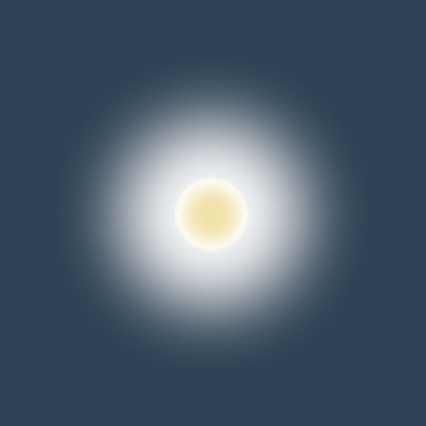
With apologies for the cliché, here is a pure css drawing of an iconic image from Stanley Kubrick’s immortal film, 2001, A Space Odyssey.
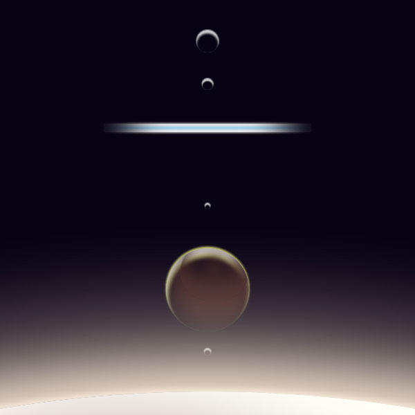
Examples of what can be done with a combination of carefully-crafted box-shadow effects and absolute positioning.
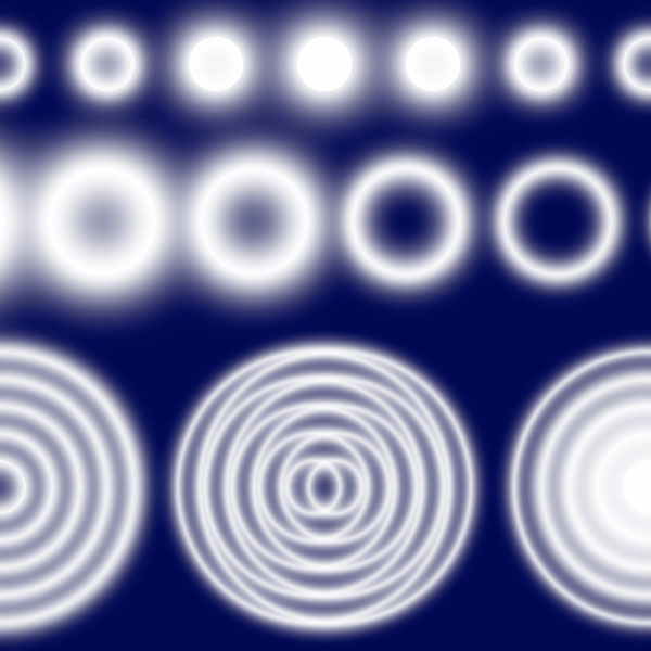
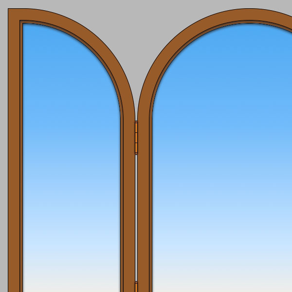
A nice drawing of a triptych. Simple html, slightly less simple css.
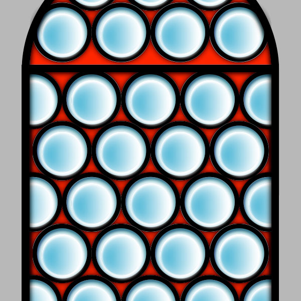
A nice drawing of stained glass window with round panes.
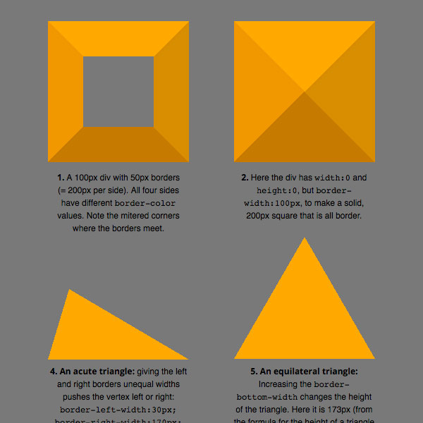
How to make pure css triangles and more.
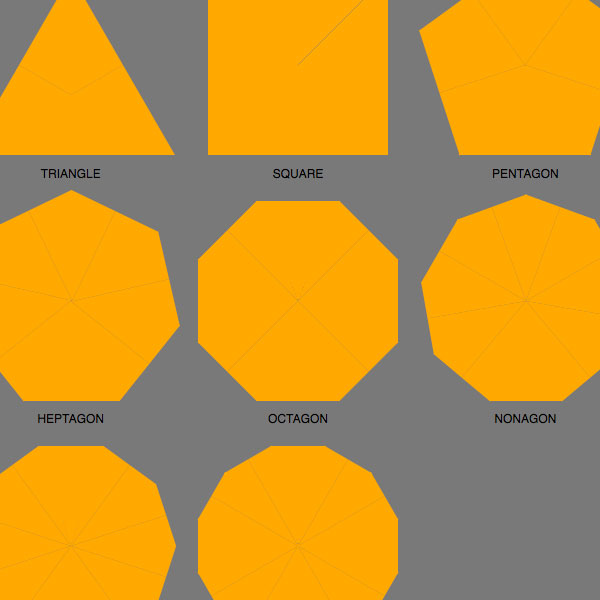
Draw polygons with multiple rotated css triangles.
Additional effects with css polygons.
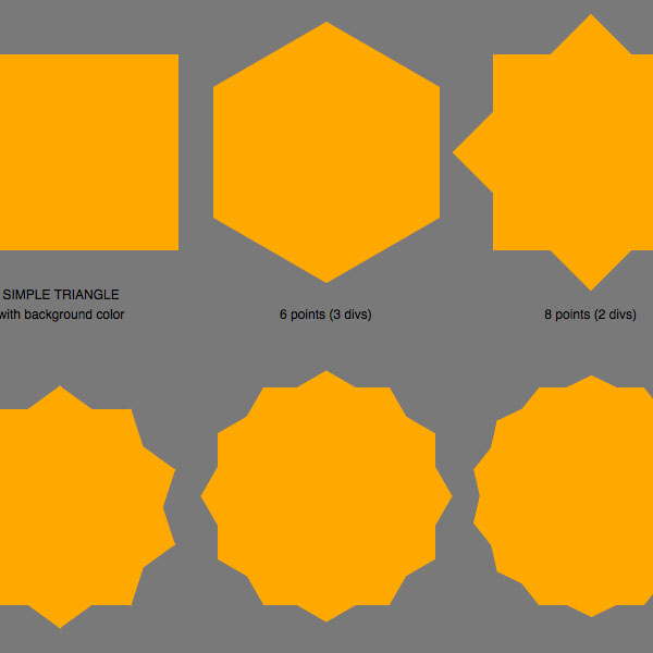
Create stars with css triangles.
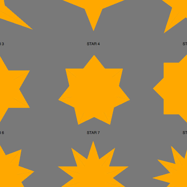
A technique for drawing squared-off stars and how to turn them into polygons.
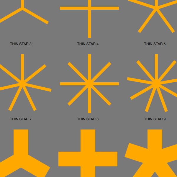
Make outlined polygons and turn them into stars.
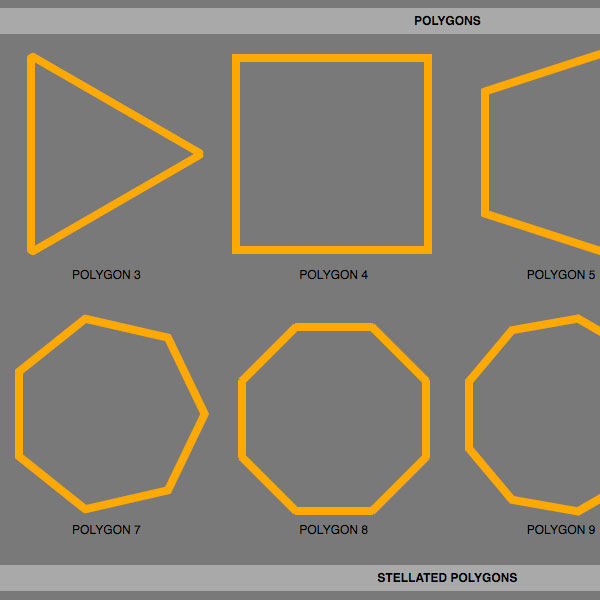
A method of drawing squared-off stars and how to turn them into polygons.
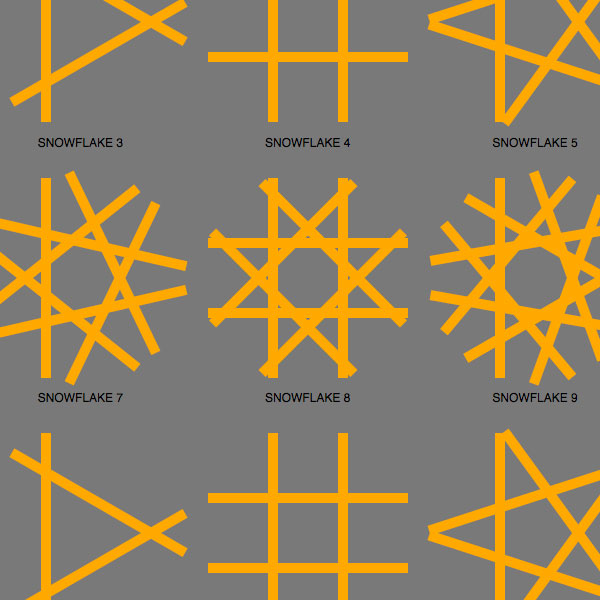
Use css Starbursts and Snowflakes to draw complex patterns.
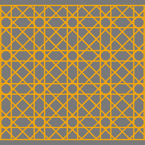
An arch made with css transform:rotate() property.
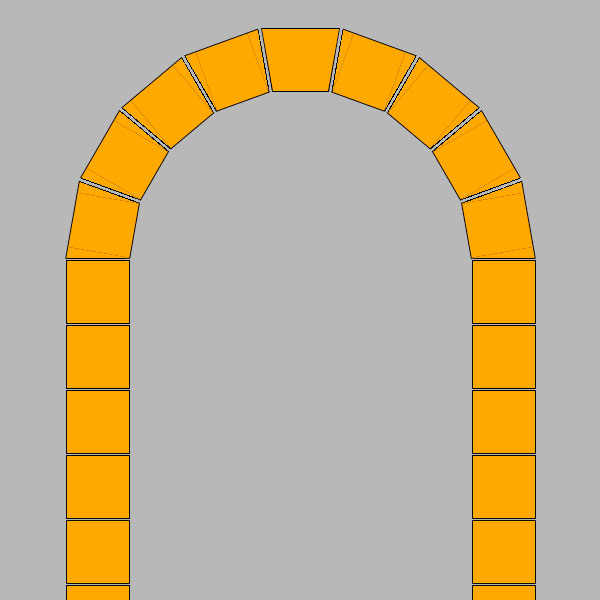
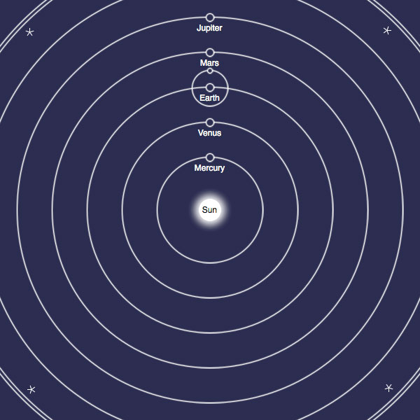
Fun with animations, transforms, and pseudo-elements.
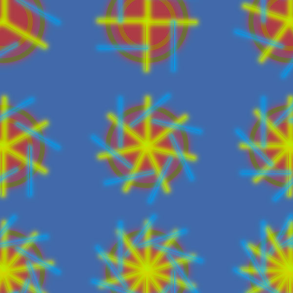
A simple layout using a single background image.
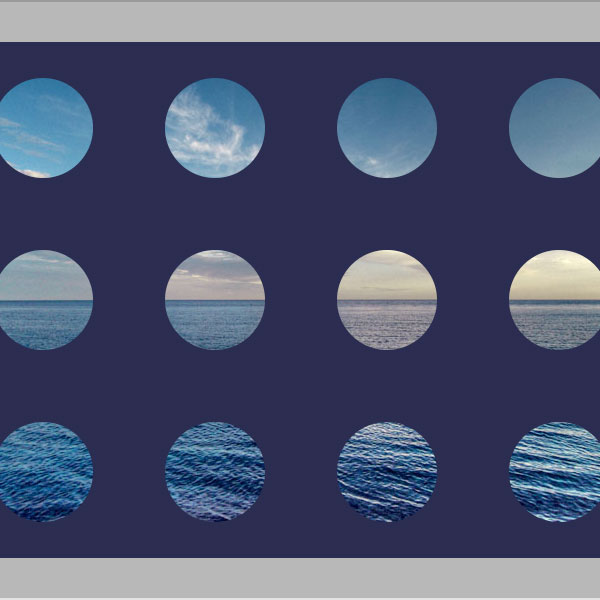
A pure css drawing of the Parthenon.

Use these styles to position elements with pixel precision.
Use these styles to rotate elements.